Wednesday, September 24, 2014

fragments shored against my ruins, or, three reviewable atlanta exhibitions i shall not review


Three Atlanta Exhibitions About Which I Shall Not Write Reviews


From the lumpy sculptures in the front to the broken clay vessels scattered across the floor in the back, adjacent to the wall text of a poem by Pessoa, “Movable Types” (the Art Papers-curated exhibition at Ponce City Market through September 28) raises questions that I don’t feel the slightest inclination to have answered, much less to answer through my own research. It’s useful to have the explanation of the wall grid of images depicting cherry stems, but it’s enough to enjoy them as glyphs of some alphabet or algorithm I’ll never understand.

The pun on “movable type” indicates the deliberately uncertain or slippery place of the exhibition in terms of form and language alike: it is a type of exhibition that resists being made conceptually immobile, or out of play rather than playfully in play, always. Like movable type, its components will be reused for other purposes (in fact the broken ceramics in the back will be distributed like some latter-day version of a Tibetan sand mandala, except that unlike the transient order of the mandala, the work began with an act of disordering that was itself a form of order...as in Wallace Stevens’ poetic assertion in "Connoisseur of Chaos," “1. A violent order is a disorder; and / 2. A great disorder is an order. These / Two things are one. (Pages of illustrations.)”

I’m very glad I don’t have to write a review of the exhibition, because it would entail re-reading Georges Bataille and re-upping my recollections of what the famous “Informe” exhibition was all about, and I just don’t want to do any of that right now.

But I think it would be great for folks who happen to be in the vicinity of Ponce City Market during gallery hours to stop by and ask, if they are so inclined, to have the show explained to them. But first and foremost, to look at all the stuff that I don’t feel up to explaining in detail. I especially don’t feel like trying to describe the videos. But the slippery quality of description is part of what the show is about. Or maybe not about, for “aboutness” itself is the problem. Ludwig Wittgenstein thought that a philosophical problem took the form of “I don’t know my way about,” but it might rather be “I don’t know about my way,” or worse, “My way doesn’t know about me.”


--------------------------------------------------------

“Alice: Curiouser and Curiouser,” at Cherrylion Studios through September 26, is a curious kind of show in a couple of different ways. Walking into it may give the feeling of falling down a rabbit hole, but apart from that, the exhibition is not really an homage to Lewis Carroll’s most memorable creation.


It’s an independent exhibition of 9 members of a critique group of women artists, as curated by Michelle Pizer of Pizer Fine Arts. It, too, deserves the level of review I simply cannot write under duress, though it holds up perfectly well without one.


In fact, it is the variety of visual pleasure in this small exhibition that makes it singularly worth seeking out in the two days or so that are left to seek it out (if you read this as soon as it is posted, which most of this note’s potential readers are unlikely to do). Patty Nelson Merrifield’s witty taxidermy sculptures alone are worth the price of admission. (Admission is free, of course, so that is less high praise than I had meant to convey with that cliché. Please insert smiley-face emoticon here.)


People who already know Linda Mitchell’s work will find new and quite different iterations of it. Ditto for Edie Morton’s encaustics, Mary Anne Mitchell’s photographs, and Chris Dolan’s drawings...Dena Light is only one of the artists who are less likely to be familiar to gallerygoers, and the same goes for Shannon Davis, Deborah Hill, and Julie Grant, all of whom contributed singularly interesting works to this diverse yet tightly curated exhibition.


And that detail-less observation brings me to:

-------------------------------------------------------------

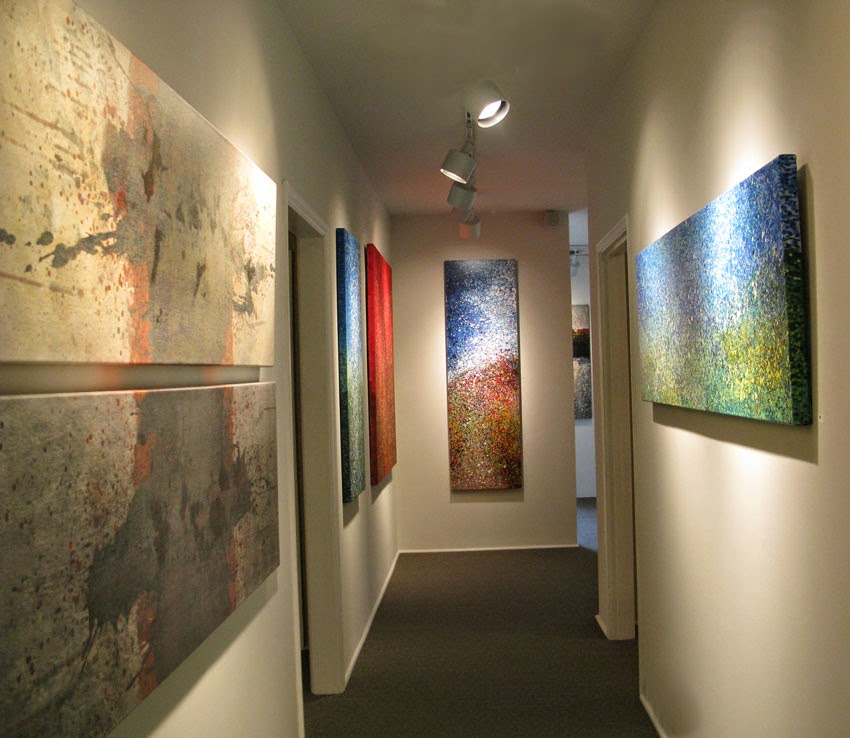
Henry Callahan’s “Beyond Abstraction: Expressing Nature,” at Reinike Gallery through September 27, is a show that will not be helped in the slightest by this note regarding its existence, for its most likely interested viewers do not read Facebook and are unlikely to find a notice on a blog.


These are loose, diversely painted evocations of places in nature, eminently worth the analysis I cannot at present give them, although they are also works which it is more important to match up with an audience than to provide with a discerning critical analysis. There are those to whom these paintings will speak deeply, and there are those who are likely to remain unresponsive to the set of aesthetics these paintings embody. That is simply a fact of human psychology and personal predilections.


It is highly unlikely that more than a handful of viewers would find “Movable Types” and “Beyond Abstraction” equally appealing, though it is possible to imagine someone who would find equal pleasure in the shattered ceramic shards of the one and the darker range of paintings in the other. (It is possible to imagine this because I did it.)


----------------------------------------------------------------

And this pathetic expression of complete exhaustion does little more than acknowledge the existence of these exhibitions and show off a few photographs (left unlabeled because with few exceptions I have no information regarding them).

And there are still more bodies of work in current and recent exhibitions that deserve extremely detailed and serious analysis, not least analysis of the mismatch between work and probable audience—this latter would be different in every city in which the work might be exhibited.

Given my interest in how different very small parts of the planet respond differently to different artistic stimuli (cf. the earlier, programmatic essays on this Counterforces blog), I am fascinated by the Atlanta-centric problem of critical and audience response to a particular species of painting.

The genre I have in mind seems to combine representational references (usually modestly specific ones), geometric abstraction, biomorphic abstraction, and gestural painterliness in one big, sometimes chaotic but just as often complexly organized canvas.

And the general response thus far has been betwixt and between; scarcely anyone seems to know what to say about it, or if they do they haven’t stepped forward to say so. And audiences seem equally indifferent when they are not bewildered.

But all that will have to wait for some other exhausted evening, or some less sleep-deprived writer.


Tuesday, September 23, 2014

a deliberately loopy recommendation to attend or contemplate an Eyedrum exhibition

“hymHouse,” at Eyedrum until the closing performances from 7 to 10 p.m. on September 26, is described as a twenty-first century homage to the example set by Judy Chicago, whose postcard from 1979 is framed and hung on the wall by the main exhibition statement. (Other highly useful notes and artist’s statements appear on foamcore cards next to the other artworks; this exhibition cannot be accused of withholding information, except in a very few cases in which the information ought to be obvious to everybody, but isn’t—which may be part of the point of the work.)

An evaluation of the strengths and weaknesses of the show is already off-limits to a male heterosexual art critic writing from a subject position that almost renders it impossible to say anything at all. Unfortunately, all of the women art reviewers who might have written about this show seem to have been too busy with their own immediate issues, including making a living by working three jobs (like artworld folks of almost all conceivable sorts).

So if I don’t tell folks they ought to go check it out, nobody else will. But I’m not offering a review, even if it sometimes looks that way.

The show is, to a surprising degree, about how we inhabit our bodies, and what we do with them while we are in them. We are not quite the same as our bodies, whether we are also immortal souls or just a bunch of socially influenced autonomic responses—but who we are is highly influenced by whether we inhabit a male or female body, and the socially shaped but largely preconscious sexual responses of that body. But regardless of the extent to which how we think and react can be changed by social and psychological circumstances, some things are primal.

And “hymHouse” is heavy on the primal and the basic social responses to the primal. It happens, however, to be specifically about how women in particular inhabit their bodies, and what they do with them and how others react to that, and that fact inevitably shapes the space of the discussion and perception by any individual writer. We never start from a universal standpoint, even when we think we do. (Those who think they do have mostly been men, incidentally, and in this particular culture, they have mostly been white, economically secure men. Just in case you were wondering.)

Stephanie Pharr’s vitrine documenting the detritus of menstruation (bloodstained panties that men without sisters or female live-in partners might not recognize as such) was counterpointed on opening night by the sight of her own largely unclad body covered only by a transparent poncho, the aforementioned genital-covering undergarment and a pair of emerald-green high-heeled shoes. The combination was disconcerting to almost everybody, and the social interpretation of this minimal combination, posted on Facebook, was also exceptionally thought-provoking, especially since the thoughts expressed in the comments were so incompatible with one another.

Andre Keichian’s video response to a wisecrack that “lesbians are so narcissistic that they just want to have sex with themselves” consisted of a sexualized wrestling match between herself and herself, projected between a chair that had been split in two and attached to the wall. The other video-and-sculpture contributions were similarly primary, if not primal: issues of pregnancy, personal grooming, and elementary forms of social interaction predominated in this contemporary homage to first-wave feminism. Questions such as how well women can handle the equations of quantum mechanics (hint: most women can do this about as well as most men, given the general innumeracy of the population) were not a topic of conversation. Co-curator Martha Whittington’s impressive accomplishments in mechanical engineering were not on display. (Stephanie Pharr and Onur Topal-Sumer were the other curators, and as I said above, I am not pretending to write a review of what they did with this exhibition; I’m just writing down a very few possible reactions.)

Part of what was on display, and on display quite exquisitely, too, was Lisa Alembik’s exercise in thoughtfully and elegantly imbalanced ceramics, an homage to her female forebears combined with a fresh take on Meret Oppenheim in a set of sculptural teacups and saucers with hair embedded or embodied in the ensemble.


To discuss this further would be to say too little or too much.

Likewise, the opening night performances other than Pharr’s endurance work (it lasted from before the beginning until some unspecified time after the end of the reception) are difficult to analyze without the use of copious notes that I didn't make; performance goes away instant by instant as it unfolds, and in between performance times, there is only the physical residue and the mute testimony of the artworks surrounding the performance space. Like the daily activity of keeping any space habitable, the effort vanishes into forgetfulness, not into history.

And I for one am really sorry that the people who could have written about all this were too overwhelmed with other stuff to spend time producing essays that could have shed light on the successes and failures of a show that was apparently a year or more in the planning.

However, the closing reception, during which a full range of performances will once again be offered (though I couldn’t find out what performances) will happen on Friday night, September 26, so there is one more opportunity to set the historical record straight, or just to evaluate the exhibition for yourself if you happen to read this in time.


Monday, September 22, 2014

Byzantine Things in the World, a Year Later: a Belated Post Delayed by Formatting Issues


Byzantine Things in the World: A Preliminary Exploration of an Extraordinary Experiment (The Menil Collection, Houston, May 3 - August 18, 2013)

Jerry Cullum

What does it mean to enter into an exhibition that changes our perception of space by way of the objects that occupy it? The answer at first seems obvious, because exhibitions have been altering space in that self-aware way since Malevich hung his Black Square in the place normally occupied by an icon, nearly a century ago. At first incautious glance, Glenn Peers’ “Byzantine Things in the World” exhibition at the Menil Collection looks to have returned the icons to their accustomed places (albeit with the intellectual saints Athanasius and Basil replacing Christ and the Virgin as they frame a secularization of the Holy Door through which the priest approaches the altar):


But we may soon notice something strangely amiss:


Eventually we may discover a chillingly near-familiar placement of a remarkable icon of the Mother of God. But in order to reach this space deep within the galleries, we must traverse a thoroughly unfamiliar territory:


There is an alternation of light and dark in which color and object rhyme curiously:


“In the gloom, the gold / gathers the light against it,” as Ezra Pound wrote of the Byzantine splendors of Ravenna, but the gold is from Rauschenberg and Klein:


The abstract gold of the wall-dominating paintings is echoed in the gold of a tiny Byzantine reliquary, juxtaposed with a gold-enhanced Entry into Jerusalem icon:


An aniconic atmospheric painting echoes the longstanding claims of abstraction to a modernist form of spirituality, a claim that reached its zenith in the Rothko Chapel:


But the aniconic painting itself is adjacent to another Byzantine icon:


Other juxtapositions seem to make other, more mysterious claims, such as Joseph Cornell’s “Owl Habitat” box positioned in equality with a Byzantine saint, adjacent to a Gobelin tapestry that has no religious content whatsoever:


The exhibition is filled with shocking contrasts of scale and lighting that also feature parallels of shape but not of function, or else of function in startlingly different shapes:


The exhibition catalogue thoroughly revises our sense of how objects ought to operate and be approached, but it gives only a faint approximation of the sheer sensory disorientation achieved by “Byzantine Things in the World,” the exhibition space, during an all too brief presentation of the things themselves:


The sense of a postmodern sacred given by the exhibition is exceeded, we might imagine, only by the vacancy left in the now-unviewable Byzantine Fresco Chapel Museum elsewhere on the grounds of the Menil Collection, a building that was constructed specifically to house the long-term loan of dome and apse icons restored by the Menil after their recovery from art thieves in northern Cyprus:


The restored icons were resituated in their traditional devotional places, but in an almost startlingly contemporary architectural setting, which Peers refers to in the exhibition catalogue as a glass chapel:


Minus the icons, which have now been returned to Cyprus after the agreed-upon loan period, the chapel might become as eloquent a space of absence as the nearby Rothko Chapel, but no one seems to have realized this, not even Glenn Peers whose exhibition was inspired by the hybridity of the original icon-inhabited space:


What Peers did recognize was the relevance of the longer-term “Witnesses to a Surrealist Vision” exhibition elsewhere in the Menil Collection, a room reproducing the sort of unexpected juxtaposition of modernist, found, and tribal objects that characterized the Surrealists’ own exhibitions.


As with this “room of wonders,” Peers’ exhibition succeeds by virtue of its manipulation of form and space long before any of his debatable propositions regarding the relational nature of objects come into play. The contexts imposed by modernist art history and/or Eastern Orthodox sacred narrative have been magicked away by Peers’ curatorial wizardry as thoroughly as the various ethnographic and art-historical contexts insisted upon by scholars have been made to disappear in “Witnesses to a Surrealist Vision.”

Primary experience has replaced reflective analysis. This raises disturbing issues for those of us who insist that human beings are, above all else, storytellers. But human beings are also creatures of induced visionary experience, makers of art that depends upon primary sensory disorientation, and humans have been making such art ever since the Paleolithic cave paintings were drawn to conform to the irregular shape of the rock, and to replicate motion when viewed by flickering torchlight.

If stories give us a sense of our place in the world, we also seem to be a species that likes to experience not quite knowing where we are, in a strangely configured space that encourages deep emotions other than simple dread. The all too briefly available spaces and contrasts of “Byzantine Things in the World” re-created for skeptical contemporaries the sense of disoriented awe that Byzantine churches did for Byzantine worshippers, and that Eastern Orthodox worship spaces still do for those who are responsive to Christian imagery and the Christian message. Determining what else Peers might have accomplished is dependent upon close perusal of his remarkable catalogue, which would have to be the subject of a separate essay. Few of the themes presented in the catalogue are self-evident in the arrangement of the exhibition, though the catalogue clears up a good many conceptual mysteries. The catalogue, however, remains available, while the exhibition exists only as a series of evocative photographs that can only hint at what it was like to move through the space itself.

Text ©2014 Jerry Cullum (all images are copyright by and reproduced by permission of the Menil Collection)

Thursday, September 18, 2014

an incredibly tiny essay on art reviewing

I am feeling melancholy about all the art exhibitions not written about in any size shape or form—not an analysis set in stone for the ages, just a writeup in terms of “Here’s some stuff that a certain demographic will like, and another demographic will absolutely hate.”

[One of the many problems with this is that not even I wanted to read the five hundred additional words I wrote about the topic. Here they are, however:]

...But in the first place, that’s a hard thing to perceive. In the second place there aren’t enough writers to perceive it. In the third place, all but the most mundane of artists like to think they are making work that does more than appeal to sixty-year-old investment bankers in one case, forty-year-old adjunct professors in another, and twenty-three-year-old baristas hoping for more meaningful jobs in yet another. Yet most art falls into this category, and I wish it were possible to write reviews that say, “None of this work will go into art history, but two or three pieces are downright memorable, and half the work is something that folks of a certain age will wish they could own.” But nearly all of us delude ourselves as to the importance of what we are doing—we either value it too highly, or dismiss it as worthless when it isn’t. Reviewers similarly over- or undervalue for reasons that are merely personal/psychological, no matter how sophisticated they think their methodologies are.

So why not more reviews that say, “Here are some photos of what I think are the most interesting works in the show; the artist says this about them (but I disagree/agree with modifications/really don’t care one way or the other), and if you like this sort of thing, then this is the sort of thing you will like.” Because there are not more people willing to spend their days seeing artwork they mostly do not like in order to write that sort of review for almost no money, for one thing. For another, it takes considerable skill in sussing out changing socioeconomic dynamics to be able to match artists and audiences. For a third thing, neither artist nor audience wants to have this relationship spelled out so baldly.

Yet some of the people who could do this sort of matchup delicately are engaged instead in trying to write “Ten fun things you probably didn’t know about Ingmar Bergman, including who he was and what he did,” and “Which endangered mammal species are you?” for almost as little money as they would get for writing a match-up type of art review. Some of them, however, may prefer this type of peonage to having to deal with the entire broad spectrum of artists and gallery operators and the people who love and hate them.

This six-hundred-or-so-word chunk of prose is the maximum length for a readable review, in any case; not enough to do justice to most exhibitions but most exhibitions don’t require justice, just audiences. Justice can be done at the artist's retrospective, if the artist is lucky enough to get one.